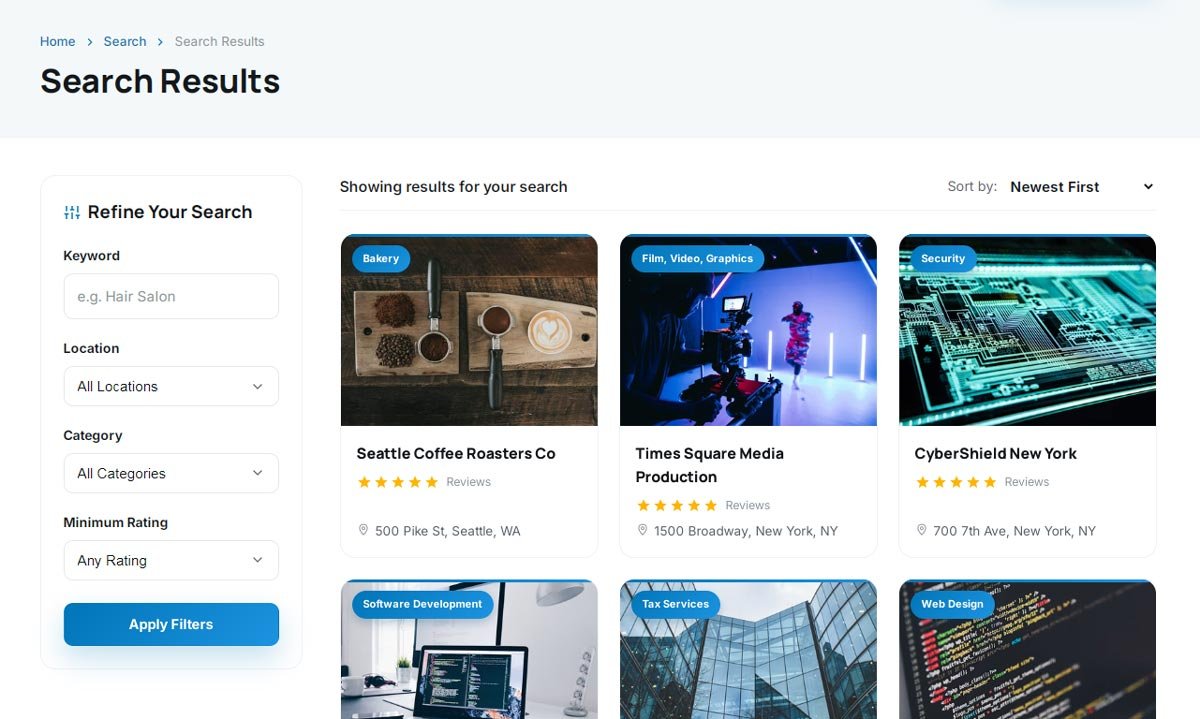
Every search resolves into a clean three-column grid, so visitors can compare several businesses at a glance. Each card works like a mini storefront — a cover photo, category badge, star rating, and exact address — giving visitors everything they need to shortlist a vendor in seconds.
Speed and relevance decide whether a search result page keeps a visitor or loses them to a competitor. A results page that dumps every matching listing into an unsorted wall of text forces visitors to do the filtering themselves — and most won't bother. This page answers the query immediately with a clean, scannable grid, then hands over real filtering power.
That's where the sidebar earns its keep. A search for "hair salon" is too broad to act on — but narrowed to "5-star hair salons in this neighborhood," it becomes a shortlist a visitor can decide from right now. That's the difference between a browser and a buyer, and it's the lead quality your vendors are paying for.
Because every card is treated like a small advertisement — a real photo, a trust-building star rating, a clear address — the page itself becomes the argument for upgrading. Free listings look plain next to featured ones, which is exactly the contrast that nudges vendors toward a paid tier.